Tuesday, December 24, 2013

Things I Hate: Wedge Sneakers

Oh man, oh man. It has been a while since I have had the pleasure of typing up a relatively coherent tangent about the things I hate. This evening, I really detest wedge sneakers.

Ever since whatever celebrity wore them first and started the manic scramble for such cheap looking footwear, I have loathed wedge sneakers. Pretty soon, ever major brand and shoe designer had their own version of the suede, rubber, leather, pleather, glitter, spiked, and hardware detailed footwear.

The standard.

Let's dissect everything that is wrong here, using the above example as our foundation.

First, they are clumsy. Their design is errant. On any normal foot, this specimen would look like it came directly out of a home healthcare catalog for 1987. Wedge sneakers look orthopedic at best. The velcro staps paired with the seemingly inflatable tongue make these look more like a gag gift than something anyone would ever ask for. When you put this with some achingly tight skinny jeans (which is all I ever see them with) you look like a break-dancing teen from Omaha in the 80's.

Second, they lack purpose. Okay, okay, okay. I knew before I started this post that making a comment about shoes needing to have a purpose would result in my blogger crucifixion, and rightfully so. I will be the first in line to say that clothes don't need to have function to fulfill their style purpose. And that, my friends, is where the wedge sneaker is different. They serve no style purpose, and therefore, should have to fulfill their purpose in function, which they clearly do not do. This is what happens when a philosophy major starts a fashion blog. So, back to the original statement. Why, exactly, would a sneaker need a wedge? A sneaker represents some degree of athleticism, whether it is implied or explicit. A wedge eliminates a degree of control and stability by lifting the heel further from the ground. Much like the platypus, this shoe makes no sense.

Third, they don't look good with anything. This point only applies if I were to concede that these shoes weren't the worst thing gracing clearance racks across the world. I'm not going to concede that point, but let's just imagine that I did for the sake of this third section. If you were to take apart each shoe part from this hybrid you would be left with a wedge and a sneaker. Wedges and sneakers alike, do not belong with every outfit. They lack a certain versatility in that way. A wedge is a safer alternative to a heel, and thus, goes with (most) outfits that a heel would go with. A sneaker is serves a casual, pseudo-athletic, comfort purpose. Putting these two shoes together like some Dr. Frankenstein-esque experiment in fashion does not create an innovative new look, but rather, a monster. The Monster.

Finally, they look cheap. I don't mean cheap in an inexpensive way. As I said before, every designer seems to have their own version of these monstrosities and they can cost over $1,000. I mean cheap in the sense that they look like they were put together from the remnants of other misfit shoes. They fulfill this perception by trying to incorporate 3+ trends in to two square feet (another pun!) of garment. You would be hard pressed to find a wedge sneaker that does not incorporate less than three of the following: suede, zippers, metallics, velcro, glitter, sequins, specialized hardware, camouflage, animal print, spikes, studs, quilting, color blocking, neon, or fringe. These shoes look like rejects. If only we, as a people, could reject their "fashion" advances.

This pair is over $1,100.
Commit to one or the other. Chances are you will never have an outfit that is appropriate for both a wedge and a sneaker, so ignore this tacky trend.

Saturday, December 21, 2013

Get Fit: Bottoms

Poorly fitted bottoms (jeans, pants, skirts) are a distraction, to say the least. Think of it this way, the bottom half of your body represents 50% of your exterior, physical self (because half is equal to 50%). That's a lot of you that should look as good as possible. This means that saggy butts, dangerous amounts of thigh exposure, and unintentionally visible ankles are not casualties of your style.

Jeans:
I worked at Gap for about 2 years while I was in college. I absolutely loved my job there (really). Every day I worked I got to sift through new product, organize clothes, and fold things. Those are things I (oddly?) enjoy. If you spend enough time at Gap, you become quite talented at being able to fit people visually, especially when it comes to jeans. So, as always, I'm the self-proclaimed expert.
Step one, tell yourself what your favorite part of your lower half is (mind out of the gutters, please). This serves a two fold purpose: you deserve to compliment yourself and it gives you some direction where to start. My favorite part of my lower body is the sheer length of my legs. I'm about 6 feet tall and don't shy away from that fact. When I am in search of jeans I look for something that shows off this attribute. Identify what this attribute is for yourself. Maybe it's your bum, or maybe it's shapely calves. Once you have identified your best assets, you can then narrow which jeans are probably going to work the best with your body. Using myself and my legs as an example, I go for trouser and curvy fits.
Step two, find your length. I personally believe that all women's bottoms should be sized like men's. I am not a "long," "average," or "short" individual. I need a 36 inch inseam (the length from your crotch to your feet), not whatever the arbitrary "long" means. Regardless of my preferences, not many brands measure women's inseams as such, so you will have some try-al (see what I did there) and error ahead of you. It is important to remember several things when considering length. Exactly what types of shoes are you most commonly going to wear your jeans with? Flats? Sneakers? Heels? Each of those shoe types comes with a need for a different length. Additionally, what is the fabric makeup of your denim purchase? This will affect about how much they shrink if you chose to dry them at any time. The rule of thumb I operate on is that jeans will shrink about a half inch when washed and dried mechanically. This doesn't mean you should just go with the longest pair you can find and hope for the best. As previously posted, it is easier to fix a something that is longer than it should be, than something that is shorter than it should be. No one enjoys the ratty look of jeans or pants that have been drug across the pavement a few too many times.
Step three, pay attention to petite and tall. This step may not apply to everyone. Tall is not the same as long, and petite is not the same as short. Long and short, when referring to length, are sort of like the "extra helpers." They provide, or take away, a few extra inches from the regular length in the inseam alone. These sizes make no proportional changes to the waist, hips, or crotch. This means, that is you need more than about one to two inches of extra or less length, you should be looking at tall or petite sizes. Tall and petite sizes take in to account that when you were growing, your femur was not acting alone. These sizes have made adjustments to how the overall garment fits in areas other than length. This also applies to other clothing items such as jackets or dresses.
Step four, get those jeans on and try them out. Walk around. Sit down. Do some lunges. Twerk. Do whatever it is that you need to do to make sure they fit in all the right places. If you can't walk, sit, or stand comfortably in your jeans before you have purchased them, nothing is going to change later.

Pants:
Pants follow the same rules as jeans but with a few other areas worth noting.
Camel toe isn't a good thing. It's a fun thing to joke about, but nothing worth committing to yourself. Unlike jeans, pants more frequently find themselves in professional or work settings. As a result, shirts tend to be tucked in, which adds an area of visibility that you may not have considered otherwise. Make it a priority to be very aware of how your pants fit in the crotch when you are in-store. Additionally, the fabric in pants tends to be less discriminating than denim, which means they may be more apt to cling to you in a way that makes you uncomfortable.

Skirts:
I would argue that skirts have infinitely more versatility now than they ever have. They work for every season and every outing. This, of course, means you should pay attention to proper fit.
The biggest lesson I can provide you regarding wearing a skirt that fits correctly, is pay attention to two things: your hips and your height.
Most skirts, unless high waisted, are intended to sit on your hips. If there is a substantial disparity in the size of your hips and waist (hourglass figures) you will likely run in to the problem of having skirts slowly ride up to your natural waist. Losing three inches of a skirt in an upward direction is a guaranteed disaster.
Similarly, your height with play with the perceived proportion of a skirt to your body. For example, if my friend is 5'5 and I am 6'0, identical skirts will not look identical on either of us. Her skirt may rest naturally three inches above her knee, while mine is exactly two inches below my butt. Unfortunately, I'm not going for this look. If you are plagued by a similar situation, this is a good time to educate yourself on the perks of sizes in tall and petite (as mentioned above).

Follow this guide and you may save yourself from certain fashion disaster. Hopefully, you can also save yourself some green by purchasing clothes that look good and fit, instead of opting for one over the other in a fit of exasperation.

Thursday, December 19, 2013

Get Fit: Outerwear

Lately, my blog has been overtaken by makeup ( my first true love), but fashion never stays in the backseat for too long. This week I came across some interesting infographics regarding proper "fit." I'm not discussing pictures on Pinterest that glorify a perfectly trainer-sculpted abdomen that is highlighted with some tricky Photoshop effects. No, I'm talking about how your clothes should fit on you. The way clothes fit is just as important, is not more so, than color, textile, comfort (scoff), and visual appeal. It doesn't matter how much a dress cost you, or which designer has their insignia on the interior label. What matters is how that dress rests on your curves or cinches in all of the right places.
Over the next few weeks I will be providing free lessons on fit (you lucky bastards). This evening it is raining ice in Iowa, so let's talk about the general category of outwear.

I absolutely adore outwear of all sorts: coats, jackets, blazers, and all the rest (I couldn't think of any others at the moment, to be honest). Due to function, outerwear pieces tend to be more of an investment rather than a throw away trend. Perhaps, above all, this means that outerwear should be given the most attention when it comes to fit.

Avoid the pull.This should go without say, as there is nothing that makes your outfit look more cheap, or you more overtly uncomfortable than a jacket or coat that pulls. It doesn't matter what type of outerwear we are taking in to consideration: if it pulls, it doesn't fit, so put it back and try again.
If you are unfamiliar with pulling, it is when the space between too seams is too tight across a given area of your body. This is most commonly seen across the chest, back, and in the shoulders. Imagine taking a piece of fabric in your hands and gripping it in the middle of the edge on either opposing side. If you pull (hint hint) the sides, you will notice ripples that form perpendicular to your fists. The tension from the fabric is forced to take from the areas where there is less tension (above and below) which causes this wave like effect.
If you come across pulling it is likely because your sizing is off or certain parts of your body aren't proportionate to what is considered the "standard" form for textiles and fashion manufacturing. This sounds like a passive way to say you are "fat and lumpy," but this isn't the case. Pulling can also be the result of the textiles that items are made from. Outerwear is made from fabrics that aren't commonly found on everyday clothing, take wool, for example. Wool, unlike cotton or spandex which is in most of our day-to-day items, does not stretch or give like other textiles. It is heavier and harder to manipulate, thus, it is doesn't provide you much wiggle room (so many puns).
The general remedy to all three of the above culprits is to go up a size. It can be a shot to the ego, but when something fits correctly and looks good, the size is irrelevant (actually, size is always irrelevant). It is likely that by picking a size bigger than what you normally wear, you are adding a few extra centimeters in the areas that are pulling.
This remedy is a double edged sword, though. If a jacket fits perfectly everywhere but in one or two places, it is likely you are going to just reverse the problems in your situation. Sure, the shoulders are no longer snug and tight, but the waist may be eating you alive. When you run in to this problem you aren't necessarily at a dead end. If the item is a must have and you would feel immense guilt leaving it on the rack for some unappreciative commoner to scoop up, then tailoring is your next step. Alterations can do amazing work, but there is a limit to how many miracles they can perform. Remember, it is easier to fix something too long or too big than too short or small. If everything fits, but the arms are too long, that is an inexpensive and quick fix. Unless you are a skilled seamstress or know of one (hi mom!), it's not something you can undo and fix on your own.
If these options aren't viable or don't work, then just walk away. There is no amount of tackiness that is worth what a poorly fitting jacket will provide.

Cut the vent.
Go to your closet right now. Grab every blazer, jacket, and coat you have. Flip them over so they are face down. Look at the bottom of the jacket. Is there a slice in the middle that is held together with a single piece of thread in the shape of an "x?" Yes? Hang your head in shame and get your scissors out. This slit, called a vent, allows a jacket or coat to comfortably move with you throughout the day. It makes the garment less constricting near the area of your body that generates the most movement. These vents are sewn shut at the end of manufacturing the ensure that during the packing and shipping process they don't become flattened at an angle, creating a crease that will never come out. Once you purchase a coat you should cut the vent before entering public. The thread that holds the vent together is often a single line that pulls out in one piece.

Hardware should match.
Sometimes I think designers let their interns choose the hardware when a design is nearing completion. Hardware, in my opinion (therefore, your opinion too), should receive just as much consideration as any other part of the design process. The hardware should match the style and function of any garment. A perfect example of this is a vintage style motorcycle jacket. If the leather is roughed up, the zippers shouldn't be a shiny gold or silver. Hardware that doesn't blend makes the garment look like more of an afterthought. Hardware is generally an easy replacement, so don't count a great buy out just because of a few odd looking buttons. Think of it as a chance to create your own one of a kind piece.

Fabric should be manageable.
As I mentioned before, outerwear comes in fabrics that are less common elsewhere in your wardrobe. Think about the fuzz that will be attracted to your new black jacket when you throw it in with your other clothes. That winter white coat may look sharp going in to Starbucks, but when you spill your coffee all over it after tripping over ice in the parking lot, then you are in for a run to the dry cleaners.
Outerwear is paramount to your other clothing because it is.....on the outside. People notice it first, it covers much of your body, and you wear it day after day. This means it requires different care from your yoga pants or pressed shirts.

Don't forget about its function.
When trying on outerwear items, don't forget what its purpose is. If you are buying a blazer for work, think about what is going underneath it or on top of it. If you are buying a winter coat, take in to consideration how heavy the sweaters are that you may be wearing underneath. If you are picking up a spring jacket, note how short it may be cropped and what challenges that might present with your seasonal wardrobe.

Important notes on closures.
Closures are any pieces or hardware or additional fabric that serve the purpose of closing any or all of the garment. This includes buttons, snaps, zippers, or belts. While closures can serve an aesthetic or novelty purpose, they are often meant to be intentional and functional. Each type of closure comes with its own set of potential struggles.

After buying a jacket, take a look at how well the buttons are secured to the garment. Depending on the style of the button, it made not be appropriately adhered and therefore, it may not last long when constantly being secured and unsecured. If you anticipate that this may be an issues, grab a needle and thread and sew them extra tight. If you don't know how to sew a button then may God have mercy on your soul.
Buttoning heavy outerwear is entirely up to the individual. Buttoning a blazer, on the other hand, actually has some guidelines. The general rule when buttoning a blazer is this: always button the top button, sometimes button the middle button, never button the bottom button. Always, sometimes, never. This applies to three button blazers, but can also be adapted for those with only two (just get rid of the middle button).

Snaps are somewhat uncommon on outerwear items, but are still worth mentioning. Always be sure to test out snaps to ensure that they actually do what their namesake implies. Occasionally snaps can become bent in the shipping and merchandising process, and lose their ability to close. Snaps are an easy fix at the hands of a tailor, but depending on what you are buying, they may not be worth the hassle. Additionally, snaps look dreadful if they produce any pulling. Always test snaps out once you have a garment on, as it may still not fit once closed.

Zippers are one of my favorite types of closures because they provide a little bit of an edge to items. Plus, they are fun to play with. Be sure to give the zippers a try before purchasing any outerwear. Zippers on outerwear tend to be a bit more heavy duty, as they should be, but can occasionally be difficult, if not impossible, to zip. Give them a quick up and down and make sure that the teeth are properly aligned and don't catch.
One final, yet very important note on zippers: if you have large boobs, zippered closures may inhibit your ability to fully inflate your lungs. They can also produce the effect of a uni-boob (singular mass of boob flesh) that is unsightly at best. Proceed with caution.

Ties or belts tend to be the most foolproof of all closures. Aside from making sure that a coat or jacket meant to come with a tie actually has it, that is about all the surveying you need to do. That said, unlike the other closure types, a belted closure doesn't allow you to necessarily choose whether you use it or not. If a jacket or coat has a belt, you should always use it. If you leave it hanging, your coat may look more like a robe. If you remove it but don't take the belt loops off, then you run the risk of looking like your forgot something.


And so we have a tutorial in how outerwear should fit. Outerwear isn't cheap and never will be, thus it shouldn't look that way on you. Invest in a pieces that are versatile, timeless, staples. Trenches, pea coats, and fitted blazers will always find a place in your wardrobe.

Monday, December 2, 2013

Nail Polish Manifesto

Welcome to my mani(cure)festo.

I have no idea why I waited to long to publish this particular stream of consciousness. Nail polish is my absolute most favorite makeup related thing in the history of makeup.

A few years ago my meager collection 50 or so bottles exploded into what how now become a vast ocean of glitters, creams, and metallics. This ocean runs about 400 bottles deep (no hyperbole there). I purchased a DVD display case just to house them all, and have recently run out of room.

Before any of you entertain thoughts about "excess," "duplicates," or "waste," just stop thinking. Mostly because I don't care about your opinion, but also because I ensure that my nails are in immaculate condition. This means that I never ruin them with fake nails or acrylics and I paint them every other day. The idea of chipped polish makes me uneasy. I don't have a single duplicate color and I rotate through my collection regularly. That said, I think I am in a position to make a a judgement call for everyone regarding the best brands on the price spectrum, so prepare yourself.


Rimmel Lasting Finish Pro ($2)
Seriously. $2 nails. Correction: $2 PERFECT nails.
I stumbled across this nail polish with scouring the clearance bins at Target. I didn't have many coral colored polishes in my collection and there happened to be a pretty coral polish by Rimmel marked below a dollar. The color served me no particular purpose as I didn't have an outfit it would round out or anywhere that it needed to go; it was cheap and I love nail polish, end of story. I swiped it on one evening with my usual two coats of color. The lacquer didn't bubble (a most dreaded occurrence), smudge, or appear dull after a few hours. Perhaps its most important quality was that it didn't chip. At all. For a week. A WEEK. I was astounded that an inexpensive product could produce such results. I bought several more bottles over the course of the next few weeks and was met with the same results. Furthermore, some of their colors were completely unique and unmatched by other brands. One additional perk of this polish is the rounded tapered brush. I have yet to meet a person with uncurved cuticles and don't understand why polish brushes remain squared off. The Rimmel brush follows the curve of your cuticle and keeps the less dexterous among us from messy fingers.
To truly show my passion for how great this brand was, I chose a few bottles to go with me on a three week trip to the UK. I new that they would last me for long periods of time without having to be changed, and therefore, would keep my nails in top condition during the trip. I wasn't disappointed.

Get it here.

Essie ($8.50)
The nail polish game jumps pretty quickly in price when you are searching for the good stuff, hence the jump in cost between Rimmel and the next lowest brand, Essie.

I have absolutely no idea when I was introduced to Essie polish; it just always seemed to have a place in my collection. I always thought the bottles were so delicate looking, so maybe that had something to do with it.

Essie is my go-to brand when it comes to what I would deem "lady-like" colors. In other words, traditional polish colors like reds, lavenders, pinks, and ivory are always top notch when manufactured by Essie. What makes these colors so perfect is how that color translates outside of the glass bottle. Reds, pinks, and purples can easily take on orange or blue hues under different lighting and may disappoint. Essie's varied versions of these colors, in my experience, have always been true to what's in the bottle and what's on my nails. Another issue with the lighter colors, like ivory, beige, and white, is that it takes 3+ coats to get the color opaque enough for the nail bed not to be visible. Unless you have four hours of dry time available and a climate controlled room to paint your nails, the numerous coats aren't particularly feasible.

In a single phrase: Essie does demure right.

Get it here.

OPI ($9)
You knew it was coming. OPI is the standard nail polish which all other polishes are compared to. I'm not sure what it is that has skyrocketed OPI to the top of it's market, but it has a strong hold on everything related to nails. I am willing to bet that everyone knows what the phrase "I'm Not Really a Waitress" means.

OPI was my first venture into "big girl" nail polish. In other words, it was my acknowledgement that sometimes cost and quality do correlate. What OPI had that others seemed to lack was a constant stream of new colors, textures, and finishes. Every few months I could expect a cute new polish line with clever titles to be released. While some of the shades would be eerily similar to colors I already had, there was always promise that the colors would never be perfectly identical.

This brand is, what I would call, the ultimate package. It really delivers in every possible category for the best price. The colors are always fresh, the formula is always consistent and easy to apply, and there is always something new around the corner. OPI often does celebrity collaborations for their upcoming lines and this leads to some interesting creations. For example, last year OPI released a James Bond line of polishes (my favorite to date) that were tied to the theatrical release of Skyfall. This collection featured an 18k gold top coat. This year, Mariah Carey's second line with OPI featured an 18k white gold top coat. Who comes up with something like that?! OPI, that's who. The brand has also teamed up with Disney to create a Minnie Mouse line, and coming soon is the Gwen Stefani polish line. Get. Excited.

Get it here.

Illamasqua ($18)
This brand is my wildcard, mostly because no one has ever heard of it. I came across this color while browsing Sephora. I had never used the brand before but was drawn to it's "speckled" colors (think a robin's egg). It was unique, new, and cute, so of course I bought three.

This brand wouldn't be featured on my blog if it the results of my impulse buy weren't positive. I found that this brand mixed casual wear with statement flair. The colors were bold, but not loud. They were attention getting without being juvenile. To me, they said, "I want to be professional, but I also don't want this stick up my ass."

The wearability was fantastic and I was able to make it quite a few days without a top coat when using Illamasqua. The speckled effect was charming and translated brilliantly from bottle to nail. Colors with non-textured finishes or formulas are equally as impressive from this brand.

Get it here.


Deborah Lippmann ($20)
I first came across this brand a few years ago, but never indulged because I was a broke college student and $20 for nail polish was too much for me. The bottles were chic and the colors were flawless; I was tempted but my willpower was too much.

One fateful day I went to get my haircut and my fabulous hair stylist at Jiva Aveda in Cedar Falls, Iowa (shout out to Sara Durrwachter, seriously, girl is a hair sorceress) pulled out a new polish she found that she thought I would like to see. She pulled out a beautiful square bottle that was filled with blue liquid and blue, green, and teal glitter ("Across the Universe," I mean who doesn't love that name? Idiots, that's who," Sara Durrwachter). Clearly, I was enamored with the polish. My day was made when she let me take home the bottle to try out when she hadn't even used it herself (talk about self-less love, no one uses my polishes first but me). I tried it on immediately that evening so I could return it to Sara ASAP. I feel anxious when I know one of my bottles is being held hostage and I didn't want to cause the same emotional distress.

As expected, the color and glitter was distributed evenly and cleanly. One issue that glitter polishes always seem to come across is uneven distribution of sparkle (this is a real life issue). Sometimes it looks like you dove, nails first, into a third grade art project and other times it looks like you barely swept your hand across a glittered Christmas ornament. Anyway, I applied two coats of Deborah Lippmann's polish and had a truly perfect manicure. The color was vibrant and dried without air bubbles. Perhaps what has kept me committed to Deborah Lippmann nail products is the "after" effect. As I stated before, I change my nail polish every two days. Lippmann's nail color lasted me well over a week before I needed to change it.

One of my favorite things about Deborah Lippmann's colors is the uniqueness and variety. The line of colors are truly one of a kind (especially her glitters). This is one of the products that I, without hesitation, think is entirely worth every penny.

 Get it here.

And there you have it. My nail polish manifesto.

Saturday, November 23, 2013

Steal and Swank: Lipstick

This might be the trickiest post in the Steal and Swank series. I love lipstick. After nail polish it receives most of my makeup affections. I've actually run in to very few lipstick brands that I didn't like; most have something good to offer.

Steal: Revlon Colorstay Ultimate ($5.49)
I can't vouch for any 24-hour stay claims (what can I say, I lead a boring life), but this stuff has incredible staying power that is on par with the more expensive brands. Revlon's Colorstay Ultimate applies similarly to a lipgloss. One application delivers complete coverage that stays....and stays...and stays. I've never needed to reapply this lipstick on a day out and it doesn't leave clownish stains on coffee cups. The finish is neither a cream nor a matte, in fact, I'm not sure there really is a color for the finish. Regardless, the pigment is strong and doesn't go anywhere until you want it to.


Swank: Makeup Forever Rouge Artist Intense ($20)
My first Makeup Forever venture came in the form of a free sample of their bright pink lipstick. I had never been a lipstick wearer before, and jumping on the train with a neon color seemed uncomfortable. It must not have worried me too much because I jumped in mouth first (dirty?) and continued to purchase their products like a junkie. The Rouge Artist Intense line by Makeup Forever touts a matte finish that never stops.This is another all day lipcolor that I never seem to find myself reapplying. This particular line comes with approximately 50 color options. My personal favorites include their hot pink, neon orange, and true red. The colors have a brilliant finish that doesn't skimp on pigmentation. Additionally, I never have to use a lip primer or lip liner with Makeup Forever lipsticks. I have yet to run in to any problems with feathering around the lips or clumpy wear.


You can buy both products here and here.

Tuesday, November 19, 2013

Steal and Swank: Eyeliner

It is important to note that I have never been very much of a eye liner snob. When I first got into makeup I always created my own liners that were eyeshadow powder based. I felt that the powder colors I already owned gave me the most versatility and options for use. I could match the colors perfectly to whatever I was doing and was able to make my lines look as blended or precise as needed. The more adventurous and more creative I got, the more I ventured into buying actual kohl liners. Initially I kept to a drugstore brand grey that served as a foundation for my powders and wasn't visible when covered. I began to branch out when I needed something to make my looks more intense or severe. My adventurous tendencies have allowed me to make the following two recommendations.

Steal: Sephora 12 Hour Wear Eyeliner

This purchase was a total impulse buy. I happened to be browsing a Sephora when some neon liners caught my eye. After testing them on my hand and loving their potency and vibrance I was sold. It took the better part of a day to finally get the colors to come off my hand, which I felt was a true testament to their staying power.
This line offers a massive run of colors (35 total) that allow me to experiment on the inexpensive end. The colors glide on with minimal effort and stay put for the 12 hours they purport, and for only $9 a pop.


Swank: Urban Decay 24/7 Glide-On Pencil

Urban Decay 24/7 eyeliners come in 40 different colors and their title does everything it claims. This eyeliner has the single smoothest application I have ever experienced. The colors are incredibly vibrant and true to every swatch and color label they use. While I most definitely consider these liners a must have, their $19 price tag has me pumping the brakes on impulse buying.


You can buy the eyeliners here and here.

Friday, November 15, 2013

Steal and Swank: Primer Edition

When face primer became a "thing" I convinced myself it was just another stupid ploy to get me to buy more cosmetics. Lucky for marketers and advertisers, their ploys tend to work. Initially, I had a hard time committing to any primer purchases. It just seemed to odd to buy a clear gel like substance that I didn't necessarily see the outcome of its use. Then I used it and realized how stupid I was.

When I first jumped in the primer pool, I started off on the low end. My beginners primer purchase was by brand NYX and was called "Pore Filler." I didn't feel as though I needed primer anywhere other than around my nose. My pores were evident and concealer and foundation always looked messy in that area. I was thrown off at first by the color of the primer. I didn't expect there to be a flesh toned tint since all other primers were either clear, purple, or green for corrective purposes. I smudged a bit around my nose and was enamored with how silky it made my skin feel. What drove me to love this product even more was how a little amount went a long way. I've had the same tube for a few months now and am only now close to running out. For $13 I think NYX Pore Filler is a great to-go primer that lends itself well to everyday use and is a great product to keep in travel bags and purses.


My primer recommendation on the "swank" end is quite predictable: Smashbox. Smashbox has what I view as a monopoly on the face primer market. It was one of the first brands to hit it big with the idea of priming one's face for makeup. It's early attention to the product and magnificent formula allowed Smashbox to soar above the other brands and keep users coming back for more.
When using this product, I stick with the traditional clear primer. Smashbox has a plethora of specific usage primers, such as color correction and luminizing. Much like the NYX brand listed above, this primer requires merely a dab to cover the entirety of your face. It is smooth, silky, and doesn't separate in the tube. What is best about this primer is that it comes in two sizes. I have a large bottle that I keep with all of my makeup supplies and a travel size bottle that I keep in my to-go makeup bag.
What makes Smashbox worth the money, is that unlike other primers, it does exactly what it says its going to do. I don't find myself suffering from what I dub "makeup side-effects," like discoloration, unsolicited shimmer, or flesh colored smears. This product is straight forward and packs a punch without any surprises. For $36 I consider it a must have.


You can buy both brands here and here.

Saturday, November 9, 2013

Steal and Swank: Mascara Edition

From now until the end of this year, I will be posting a new series of updates titled Steal and Swank. In this series I will bring you the best makeup "steals" and those which qualify as a bit more "swank," (i.e. pricey). All products that are featured have been tried-and-true by your favorite inconsistent blogger.
The first installation is mascara. I decided to feature mascara because it is my number one essential makeup item. I was wonderfully blessed with translucent eyelashes and eyebrows. Pair this with fair skin, freckles, and red hair, without mascara I look ill or "off." It's not a particularly good look. That said, I've had plenty of time to try out endless brands of mascaras.

Steal:
Maybelline Great Lash
$6
This should be a surprise to no one. Maybelline has easily one of the single best mascaras on the market. This age old formula is a classic and a staple for any makeup aficionado.
Great Lash doesn't flake, it goes on smoothly and without clumps, and it separates and defines. The pink and green tube a go-to for all of my makeup kits and I never want to be without it.


Swank:
Lancome Defincils
$27
Prior to this mascara I had never used Lancome products before. This is one situation that I can blame solely on advertising. Every Lancome ad I have ever seen in a magazine looks like it was assembled by a 14 year old who just pirated a trial copy of Photoshop online. The ad's are just atrocious. Last year, though, I received a sampler set of mascaras from Sephora (highly recommend this, they come out with one every year). A small bottle of Lancome was included. I held off on using it for a bit, as I was more interested in the tubes of Smashbox, Tarte, and Korres. When I finally broke it open, I was wildly impressed. The brush coats the lashes evenly, but leaves behind the blackest pigment. Lancome Defincils gave me dark, dramatic, and voluminous lashes, with minimal effort and no reapplication needed.


You can purchase these items here and here.

Thursday, September 26, 2013

Know Your Prints

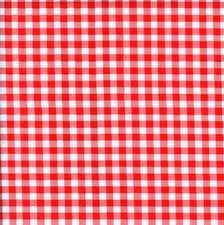
I try not to be obsessively particular when it comes to conversations about fashion. Everyone has their own likes, dislikes, trends to follow, and those to leave behind. I get it, do your own thing and own it. One point of conversation that is impossible difficult for me to not reign over is the mislabeling of prints. I'm not entirely sure why it bothers me...but it does. Gingham is not the same as plaid, and there is a difference between buffalo, tartan, and Glen. Houndstooth and herringbone look nothing alike and not all stripes are pinstripes. This is my crash course, offered free of charge, to help you all get it right.

Gingham is a linear crossover pattern that utilizes a single color, equal spacing, and equal width. Gingham is most commonly found during the spring and summer months, and is almost always on a button down shirt of some sort.
Not plaid.
Now for the plaids. Plaid is always a popular print because it comes in an insane amount of colors, sizes, and textiles.
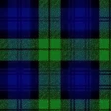
First up is tartan plaid. Tartan plaid is what people traditionally associate with Celtic traditional clothing. It usually is made of wool (culturally and historically) and is in rich colors like navy, green, red, and black.
Tartan.
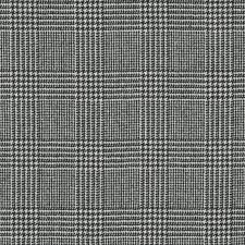
Next is glen plaid. Glen plaid is one of the most refined prints and in many ways can be utilized the same as a neutral. The lines in this print are minute and fine, so much so that TV broadcasters and journalists avoid the print at all costs due to how poorly it reads on video. It is difficult to find Glen plaid in colors that aren't some shade of grey, brown, or black (with a single line of red). Glen plaid is a great suit pattern that comes off as daring and dapper.

Glen.
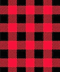
Buffalo plaid wraps up the plaids. Think hunting and flannels. Buffalo plaid is like a pumped up gingham in the number of lines it uses. The patten is a linear criss cross, but the difference is the lines within the lines (Inception style). Macro lines are composed of diagonal micro lines (the picture makes more than this description). As I mentioned before, this print is traditionally found on flannel button downs and is one of the limited fashion items that has fashion and function (warmth and layering).

Buffalo.
Houndstooth had its moment a few years ago when it was on every imaginable fashion item. It quickly became played out, but it is no less a classic print. Houndstooth is characterized by uneven, alternating points that resemble....a hounds tooth. This print is almost always done with black and white textiles.

Houndstooth.
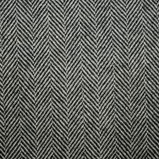
Then there is herringbone, named for its resemblance to an animal carcass. Herringbone is characterized by its chevron shaped lines that alternate in direction. It is consider a classic print and is a fabulous print for blazers. Herringbone doesn't come in a ton of color varieties, so classic earth tones are almost exclusively used.
Herringbone.


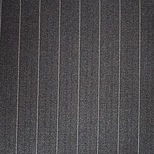
And last but not least, there are the stripes. Vertical and horizontal lines do actually have depth and should be appropriately distinguished (otherwise you will hurt their feelings). What I believe to be the most important stripe to distinguish from the others in the pinstripe. Pinstripes are an icon of gangster fashion and cliche banker suits. Pinstripes are as thin as they come (usually a single thread line) and are a go-to for suits and business wear.
Pinstripes.
And that is your crash course in oft-confused patterns. So, when you are picking out your airy button down to go with your daisy dukes, don't you dare call it plaid.


Wednesday, August 28, 2013

Smashbox Liquid Halo Foundation

It has been the better part of forever since I have posted. I've recently begun a new career and moved to a new city, so adjusting properly (and scoping out shopping prospects) has been paramount.

Over the past few months I have been in search of the perfect foundation. Usually I rely on BB cream to cover my face every day, but it just seemed as though it was no longer doing the trick. I wanted something more targeted and specific. So my search for the right foundation began.

It always seems that whenever I need to find a certain product, I can never meet my own standards. This goes for clothes, shoes, makeup, everything. The second something becomes a need and no longer just a want, virtually everything that meets my criteria magically disappears. Rough life, right? The same thing happened when I started my search for foundation. Hundred of brands and bottles available to me, yet none of them even come close to what I am looking for. Nothing matched my complexion, my undertones, or the consistency and coverage I needed. The backs of my hands had been smeared with seemingly every foundation there ever was.

This week it all became clear (or perhaps I should say flawlessly covered). Smashbox recently released a new line of foundations called Liquid Halo. The coverage is buildable, but not heavy. It blends perfectly and doesn't highlight any lines or blemishes. I found my fix. The bottle comes with a substantial price tag of $42, but it is simply one of those products that is worth it.


The lightest shade matched my skin perfectly and didn't make it appear yellow (I have very pink/red undertones). It didn't hide my freckles or emphasize them. It provided a smooth canvas that didn't look plastic or doll-like, and it was just so wearable.

Foundation is one of those products that is impossible to make general recommendations on. Every skin color, tone, and texture is different, and no brand has a corner on this market.

To help pick out the perfect foundation you need to establish your needs. This rule applies to all makeup and similar products as well. Is this something you will only wear for special occasions, or do you want a flawless, doll-like complexion every morning (and have the time to commit). Answering this question will lead you in to any number of different paths to pick the perfect foundation.

What type of skin do you have? I'm not talking about color, but skin issues or texture. Oily, dry, combination, acne prone, normal? Oily skin or acne prone skin should stick to lighter, oil free formulas. Those with dry skin should aim for hydrating formulas.

Next, what do you put your face through on a regular basis? Are you out in the elements regularly, because you need to up your SPF and select a foundation that is light and won't wear off as a result of weather or pollution variables. Are you under harsh lighting for long hours of they day? You may need to go through a long trial and error process to find a foundation that doesn't make you sickly or overdone under flourescent lights.

What are your habits? Do you fidget or touch your face frequently? Do you rub your eyes? Wear little or no makeup? Wear a lot of makeup? These questions should help direct you in terms of what type of coverage you need and what product consistency you should select. Powders are great for full coverage and covering up all manner of imperfections. That said, they can also be uncomfortable and make skin feel "tight" so slather on the moisturizer first. Liquids are incredibly versatile and come in a wide range of covers, from light and luminescent to thick and impenetrable.

Shade matching is the last piece of the puzzle and is entirely based on brand selection. I happen to be so pale I'm almost translucent, so under every circumstance (so far) I can pick up the lightest shad available by every brand. Ideally, when testing products, you want to use your face rather than the back of your hand or forearm. Obviously, this isn't always feasible unless you want to have technicolor cheek bones. There are really a bevy of shades available and don't settle until you find the right one. For women of color, Iman Cosmetics specializes in creating useable and blendable shades for complexions on the darker end of the spectrum. Most drugstore brands to not lend themselves well (without chemist level mixing and blending) to giving deep skin tones foundation options, so cosmetic brands that align themselves to specific markets have the best choices around.

Look for a product that essentially disappears when you rub it in to your skin (this means it matches). If you select one too light or too dark, your blending will be off (think of your ears and neck). Find a solution that doesn't fight with your skin, otherwise you will give yourself more problems to address. Make sure the product isn't settling in to, or highlighting, lines and blemishes. Don't buy anything that complicates any skin problems you may already have; it's not worth the battle. Sometimes it will be inexpensive, and sometimes it won't. If you are questioning price tags, refer to the first question I posed: what are your needs? If this isn't an every day product, then a $50 bottle of YSL foundation is only going to cause resentment. Many drugstore brands can do your face justice, just be cautious of trying them out in store since most don't have testers available.

As far as application, it is really a matter of comfort and precision. Clean fingers apply foundation just fine and cover relatively evenly. Sponges create a flawless look that is highly blendable. Brushes allow for targeted application (though it takes a bit more patience to get it right).

Ulta and Sephora are the best spots to try a load of foundations on in one place. Sephora has recently introduced an in-store complexion tester that measures your skin on several different levels, and selects the perfect product for you among all of the brands sold in store. The service, Color IQ gets rid of a lot of the guess work and is surprisingly accurate, but before you go in for the free service, remember you might be pressured in to buying something that doesn't mesh with your needs or price range.


If my recommendation sounds good enough to splurge on, you can buy Smashbox Liquid Halo here.


Saturday, July 27, 2013

Things I Hate: Street Style

I find it next to impossible not to loathe street style. That's just how it is.
Dumb.
On the face of it, street style spits on the Prada pumps of the fashion industry. It throws immense amounts of shade on the notion that style and fashion must be prepackaged and trends are routinely prescribed to the masses like an antibiotic. For what it's worth, I find that aspect valuable. Unfortunately, street style, as it is now, has this nonsensical obsession with buying ridiculously overpriced and atrocious looking clothing and pairing it equally as awful accessories and shoes in an attempt to look more ridiculous than the person a tent ahead of you at fashion week.

Dumb.
Street style is looking weird for the sake of looking weird. In doing so, you solidify your spot on some pedantic New York Fashion Week style blog. It is a matter of finding 7 or more pieces that are unique, distinct, uncomfortable, and unmatched. In theory, this seems like the perfect way to express individual style. Unfortunately, it comes off as a guise for attention, like a "who can look the most inane" contest. 

Dumb.
I would liken modern day street style to Version Two of the original hipster. Before it was PBR, flannel shirts, and shitty music. Now it's clothes that don't fit properly and an inflated sense of ironic humor. The primary similarity being that both groups come with their own trust funds. 

Let's analyze one of these contemporary clusterfucks.

Dumb.
From top to bottom. 
A hat with ears like nubs. It's cutesy and juvenile, and screams "daddy issues."
Fox or rabbit fur coat. Announcing that money is no object, or at least that an ugly jacket is far more important than meals for three months. I think the assumed elegance of a fur coat was intended to negate the preschool cap.
From what I can tell her bottom is a Nike tennis skirt. It signals the aloofness or the upper class in New York City, and supports function and form.
Black tights, because shit's cold, yo'.
Finally, in a failed climax, high-top metallic sneakers. A nod to carefree youth and transcendence of cultural boundaries.
What this all amounts to is jack shit.

Dumb.

Street style is intended to look like the wearer spent minimal funds and effort to compile his or her choice outfit. In reality, we all know that the individual pieces of the outfit were incredibly pricey (because cost trumps style and quality) and an immense amount of time was put in to selecting the items which clashed the most. The outcome is still the same, rolling around on the closet floor with the lights off and calling the result wearable. 

Dumb.
Fashion and style are meant to be beautiful and individual. They are meant to be expressive yet artistic; something that is pleasant to the eye and communicates to observers. Street style just doesn't do that. It's not avant garde, it's just...atrocious. It is weird and ugly for the sake of being weird and ugly.

Dumb.

Thursday, July 18, 2013

Lipstick Perfection

My love for lipstick has only been relatively recent. A few years ago the idea of wearing something on my lips that was not within a one or two shade range of my natural lip color was unheard of. There were simply too many things that could go wrong. Would it end up on my teeth? How do I know what type of shade is right? How do I know what finish I want? Is lip liner necessary? What about reapplication? I already have full lips, am I going to look like the clown in It? Just thinking about these things is stressful enough to make me want to put all of my makeup away. The easiest answer to all of these questions, I have discovered is: you'll figure it out.

I took the proverbial plunge one Christmas. My mother had purchased me some cosmetics from Sephora and because it was around a holiday, the package came with a ton of free samples (which are my favorite). One of these samples was a small lipstick tube from the brand Makeup Forever. When I opened the tube I was presented with the most florescent shade of pink I could imagine. I loved the color potential immediately, but had no idea of how or when to use it. I was only vaguely familiar with the brand. All I knew up to that point was that they did not retouch their models' makeup in print ad's. This was supposed to be a testament to the quality of their product.

The tube of lipstick sat in my makeup collection for at least a month before I finally broke it out. I knew that bright red lips always look stunning with a simple winged eye, so I assumed that hot pink would do just the same. I broke out the black liner and lipstick and decided just to wing it (ah, a pun). I had no lip liner or other materials to prep my mouth. Luckily the color went on precisely and looked fantastic with minimal effort from myself. Within a few moments the color dried to a matte finish and had not yet ended up on my teeth or skin. It just so happens that my first real experience with noticeable lip color was the best it could be. The color was shocking. The brand was fantastic. The wearability was spot-on. Shortly after my success with that tiny little sample, I started stocking up on all manner of shades. I collected a bevy of reds, oranges (yes, orange!), and pinks. I kept away from anything that could be labeled as natural or subtle and went for a raver-in-daylight look.

Lipstick is a terrifying product because there is so much potential for application to go awry. I would like to think at this point I have it all figured out. Follow these steps and you'll be set.

1. I always plan ahead so I know on what days I plan to wear lip color in order to coordinate with my chosen outfit. Because of this, I am able to prep my lips ahead of time. In the evening, just before bed, I slather on a metric ton of lip balm (usually Carmex). I try to get as much on my lips as possible so it will continue to absorb all night. In the morning I wipe off any excess and usually at least some dead skin that has loosened up as a result.

2. As I am getting ready in the morning I use a lip exfloliator to loosen up any last bits of loose lip skin (that just sounds awful). The brand Soap and Glory has a fantastic one called Mighty Mouth. One one end is a smooth lip balm and the other is a exfoliating balm. Used together, they prepare your lips to be the perfect canvas.

3. After exfoliating I add a thin layer of regular lip balm (anything works). It may seem like just an extra step, but some lip sticks can really dry out your lips throughout the day. Generally lip pigments don'e lend themselves well to layering with balms and thus, it is either one or the other. Therefore, I use a balm right before application to give myself as much moisture as possible before final application.

4. Now we get to the fun stuff. Wipe off the lip balm and any other residue that may be on your lips (I recommend brushing and flossing be finished before going forward). Make sure you are woking with a clean slate. Anything that is on your lips is going to mix with your choice of lipstick and this can mess with coloration or finish.

5. You can apply your lipstick with a brush or straight from the tube. If you have a steady enough hand, using a brush isn't necessary. I have used brushes before and didn't see any benefits one way or another. The only time I have found them absolutely necessary is when using any type of color that comes in a pot or squeeze tube. Start in the middle of your bottom lip, since that provides you with the most uninterrupted space (this allows you to ensure you are comfortable with the color). Smooth a thin layer all through the middle of your top and bottom lip. Slowly point and dot the pointiest end along the inner perimeter of your top and bottom lips. Avoid dragging the lipstick because it is easier to color outside the lines that way (which in this case isn't a cute move). Connect the dots you created and fill in any spaces.

6. Blot your lips using a Kleenex or other thin cloth that won't leave fibers on your lips. The blotting may seem dated, but it is what keeps your pearly whites white.

And there you go. Depending on what type of finish you select (creamy vs. matte, for example) reapplication throughout the day may be necessary. Matte lipsticks have the longest wearability but tend to dry out the lips the most. Creamy finishes need more frequent application, but won't leave you feeling parched at the end of the day.

As for picking out colors: do whatever the fuck you want. That's my philosophy at least. I have orange hair and wear neon orange lipstick because I'm fabulous and that's what I want to wear. I suggest you do the same. It is most important to make sure not that the color matches your skin tone, but that you are comfortable in the color.

I've encountered several great lipstick brands and would highly recommend the following: LimeCrimeMakeup Forever, and Obsessive Compulsive Cosmetics.


Friday, June 28, 2013

Menswear & Oxfords

It's no secret that I adore menswear. I drool over fitted blazers, tailored trousers, and hand-tied bow ties. What I love even more than all of those parts, is the sum of the woman who confidently wears them. My wardrobe, which I will post pictures of eventually, is a menswear Mecca. There is nothing that makes me feel more powerful and confident than than a perfectly-put-together menswear inspired outfit. This generally entails a sharp blazer, pressed button down, cigarette pant, and a sharp pair of oxfords. And that last piece is just what this post is about.

Oxfords can be a tricky shoe to for women pull off. There is almost nothing feminine about them (when done properly, like with wingtips and brogues) so it is the details of the shoe and the outfit that are essential to making them a perfect fit.  When I shop for oxfords I look for a shoe of substance. Good oxfords usually don't come at a steal price. The shoes should be lightweight, yet have solid sides and soles. They should not be able to fold into themselves like an everyday flat. Shoes of this quality keep creases from developing around the ball of the foot and toe area. These creases can quickly cheapen any outfit. It is imperative to walk a few rounds in new oxfords; their stiff body can painfully dig into heels and there is nothing powerful about a new-shoe-created limp.


Oxfords are wildly popular at the moment and finding the perfect pair that mixes masculinity and femininity together isn't always too difficult (you just have to know what to look for). A well-made oxford is clearly a nod to classic men's style, but its color, laces, and texture are what brings out its inner goddess. Colorblocking, which is also having its style moment, is a great option when applied to oxfords. Look for a neutral body with a bright colored sole or laces. Textures also provide a feminine option. Depending on the style of the oxfords, small panels of the shoes can be covered in metallics, glitter, sequins, or prints. This makes the shoe a bit less versatile as far as composing outfits, but they are definitely eye-catching statement pieces.


This style of shoe isn't always the most versatile, but there are certainly some outfits which would not be complete without them. My go-to styling option is with bootcut or boyfriend jeans, haphazardly cuffed about two inches about the ankle bone. This highlights the shoe and adds a bit of casual flair to the entire ensemble. I always suggest keeping the upper part of the outfit relatively polished in order to achieve balance (think a tucked in, starched button down with rolled up sleeves and a grand watch).

My suggestions of the best brands for oxfords are JCrewNasty Gal, and Anthropologie.

Sunday, June 23, 2013

Things I Hate: High Waisted Shorts

I decided that my blog needed an ongoing post thread regarding the things I hated instead of the things I loved. The general theme of the blog focuses on products and styles that I personally promote and admire, but this meant it lacked the healthy cynicism that I always have on hand. To this end, I have created "Things I Hate." Enjoy!

The first inductee into the "Things I Hate" library is...

High waisted shorts from Hell (aka, a 1982 closet).
High waisted shorts are just the worst. Seriously. It is like fashion decided to pick the most universally unappealing, unsavory, and unflattering item available and make it hyper-trendy. It's kind of disgusting.

Let's take a moment to analyze how truly awful high waisted shorts are.

First, exactly who are these supposed to look good on? Rhetorical question. Sure, they highlight a slim waist, but at the expense of imperfect thighs that touch and camel toe. When did fashion (note: this isn't style) become a mockery of the female form? It requires that women take the parts of their bodies they feel most uncomfortable about and put them on display in the most unbecoming manner.

Second, I would be less at odds with this god-forsaken trend if it wasn't synonymous with the most atrocious styles. High waisted shorts seem to be exclusively available in acid washed denim circa the 80's. If it isn't pale denim, it is Lycra ridden cotton candy colors that are most likely studded or ombre. What this amounts to is an awful trend on top of other awful trends. It doesn't get better, it gets worse.

Third, these shorts do not recognize proper female anatomy. Since when does the ass start mid back? Since modern medicine did away with severe spinal abnormalities. Also, when women wear high waister shorts I can only imagine the level five yeast infection they are about to walk (literally) into. Enjoy.

High waisted shorts always make the wearer look like a third grader's stick person drawing that doesn't take torso proportions into account. This is one of those silly trends that I can safely assume will be wiped out in a matter of months, much like the yeast infections it brought with it.

Friday, June 21, 2013

Obsessive Compulsive Cosmetics Lip Tar

My daily makeup routine is quite the process. Creams, colors, brushes, falsies...it's a lot to keep track of. Regardless, I love every moment of it and every opportunity I have to create something new. It really is an art that requires imagination as well as precision. That said, over the past few years I have transitioned into what would be consider "prestige" brands. These are brands that cost a pretty penny, but prove their worth.

My most recent venture into a new makeup brand has been Obsessive Compulsive Cosmetics; specifically their Lip Tar. I was aware of OCC, but had never purchased any of their products. I was not too keen on putting something on my mouth when it had the word "tar" in the title. But for a long while I had been looking for a truly vibrant violet lipstick and couldn't find one that met my needs. Everything I looked into seemed to be too dark or cartoony. I came across Hoochie (that's one way to sell a lipstick) on Sephora and believed it would finally end my search for the perfect purple.

I was so content when I first brushed the color on my lips. The lipstick is contained within the squeeze bottle shown above. It comes in a zip pouch with a small lip brush. Normally I don't use lip brushes to apply any color, but found this brush easy to use and a necessary tool for such a bright color. The product applies smoothly and has a minty taste. Perhaps what makes this product the most unique is that the user can determine exactly how potent she wants the color to appear based on the number of applications and layers. I used two layers to achieve the perfect violet color and after a few minutes it created a matte finish. 

Overall, I was sold by Obsessive Compulsive Cosmetics Lip Tar. The brand has a massive repertoire of colors (think black, yellow, blue) and a little bit goes a long way. The color wears well and I only had to reapply a few times throughout the day. As with all matte finish lipsticks, the product doesn't hydrate too well, so it is imperative for the user to load up on moisturizer prior to application.


You can purchase OCC products here.

Friday, June 14, 2013

Queen Helene's Mint Julep Masque

Very rarely do I come across an item and fall in love with it having not done the list bit of research on the product in question. Obviously, by the tone of that first sentence, this is one of those products.
Queen Helene's Mint Julep Masque is just crazy good. A few weeks ago I was in search of a clay/mud masque just for the nights when I wanted my skin to feel extra clean. I wasn't about to drop $20+ dollars on something I could only get a few uses out of, so it took me longer than I would have liked to finally discover this product. Initially I searched the trusted aisles of Target for something that met my qualifications but left empty handed (well, in the masque sense, I always leave with something from there). I then popped over to Sally Beauty Supply to check out some nail polish when I happened upon a big ol' tub of Queen Helene's face masque. The price was right (at under $6) and it was exactly what I was looking for.

Normally I proceed with serious caution when applying unresearched products to my face. I have incredibly sensitive skin that dries out easily. My skin reacts quite violently to many products, so it wasn't necessarily my best judgement to slather this product on right away. The minty green masque felt great going on: it was opaque with only one swipe of my fingers (a little goes a long way) and it initially had a cooling sensation. As soon as I had the masque completely applied I felt a burning sensation that was followed by an "oh shit." The sensation subsided almost immediately and my face didn't seem to take any more issues with the gunk I put on it. In about 12 minutes the masque had dried completely and cracked when I started to make facial expressions. I ran a clean washcloth under warm water and wiped the hardened clay off my skin. When my skin was once again visible it looked and felt fresh. Granted that word gets thrown around quite freely when describing products of this nature, but it's the truth! My skin was smooth, not the least bit red, and just looked so clean.

I use the masque about twice a week and always make sure I exfoliate and wash my face prior to applying the masque. I also give it a quick wash to rinse off any left over residue from the masque. As always, I slather on a strong moisturizer afterward to negate any moisture pulled from my sensitive skin.
I absolutely adore this product. It is simply phenomenal and the price is incredible.

Queen Helene's Mint Julep Masque can be found here.

Monday, June 10, 2013

All Hail Betsey.

I have a loud personality, so to speak. I'm the type of person who you can't ignore when I'm in a room. This isn't to say that is always a good thing. I like my style to reflect my personality. To this end I am a devote follower of the Church of Betsey Johnson.
All hail Betsey. The 70 year old that executes a cartwheel at the end of every runway show.

A few years ago I became aware of Betsey Johnson (BJ for short) when browsing the jewelry section at a local TJ Maxx. I remember finding a really cute bow ring packaged on a bright pink sale card. I absolutely loved its eye-catching nature and its gaudy, yet feminine, appearance. She is like the Vivienne Westwood for the masses. That was the humble beginning of what was to eventually become a full-blown obsession with all things BJ.
For those of you who are not familiar with the brand, BJ is, what I would describe, as feminine-punk on a nightclub vacation bender. Her products are loud, garish, and not for the faint of heart...which is exactly why I love them.
Perhaps what draws me the most to Betsey is that not everyone can pull it off. I know that when I buy one of her statement necklaces, it is highly unlikely that I will ever run in to someone who is also wearing it. Her products simply require a certain confidence on behalf of the wearer. Not everyone can walk around with Saturn around her neck.
One of my favorite pieces in my collection.
While I may love everything that is encompassed in the Betsey (and now Steve Madden as a result of bankruptcy) empire, I rarely purchase much outside of jewelry. Her clothes were not made to fit a body like mine, so I stick to the racks upon racks of baubles and glitter. 
BJ releases new lines regularly, so I never miss out on adding some new items to my collection. I recently added this blue alligator ring to my repertoire.


It even has a little pink bow tie!
Most of my Betsey finds come from Dillards, TJ Maxx, Von Maur, and her direct website.
Her jewelry prices often range from the high $20's for stud earrings to the $185 mark for her larger pieces (mostly necklaces and bracelets). 
Look for bright pink tags when scouting out her items in a store, they are simply impossible to miss.